Process Color vs Spot Color: The Ultimate Guide in 2026
- Written by: Dauxin Team
- Last Updated: December 15, 2025

Table of Contents
Color decisions affect how customers perceive your brand before they ever touch your product. In packaging, choosing the wrong printing method can lead to unexpected costs, inconsistent brand colors, or poor reproduction of your product photography.
This guide explains the crucial difference between spot color (premixed inks like Pantone) and process color (CMYK), shows when each method is best for packaging, and provides a practical checklist to help you choose the right option for your next packaging order.
What is Spot Color?
Spot colors are solid colors created using a specific, premixed ink. Unlike standard home printers that mix colors on the page, spot ink is mixed before it goes into the press, usually following a standardized color-matching system—the most common being the Pantone Matching System (PMS).
Because spot inks are premixed and applied directly, printed areas utilizing spot colors don’t show "halftone dots" under a magnifying glass—they show a solid, uniform coating of ink.
Why use it?
Spot color is ideal when you require exact color fidelity. This is non-negotiable for:
Brand Logos: ensuring Coke Red or Tiffany Blue looks the exact same worldwide.
Specialty Inks: Metallic gold/silver, fluorescents (neons), or opaque whites.
Consistency: Ensuring a color looks the same across different print runs.
Pro Tip: Spot colors are heavily influenced by the material they are printed on. A "Pantone Red" will look very different on a white glossy box compared to a brown kraft shipper. Always verify your Pantone code ending (C for Coated, U for Uncoated).

What is Process Color (CMYK)?
Process color uses four specific inks—Cyan, Magenta, Yellow and Key (Black)—printed as millions of tiny, overlapping dots. When viewed from a normal distance, these dots visually blend to form a full spectrum of colors. This method is commonly known as the "four-color process."
Why use it?
Process (CMYK) printing is the industry standard for:
Photographs: Real-world images require millions of color variations.
Gradients: Smooth transitions from one color to another.
Complex Graphics: Designs with 4+ distinct colors.
Cost Efficiency: Because all colors are generated from just four plates, you don't need to pay for extra setup fees for every new color introduced.
How Spot and Process Color Are Printed
Spot Color Printing
Each spot color requires its own printing plate (or screen) and a specific run through the press. If your design has three spot colors, the printer must prepare three separate plates and mix three specific buckets of ink. This ensures consistent, predictable results.
Process Color (CMYK) Printing
The document is mathematically separated into four color channels (C, M, Y, K). During printing, four plates are used, each laying down very fine dots at specific angles. This is highly efficient because only four plates are needed regardless of whether your design has 10 colors or 10,000 colors.
Hybrid Printing (Spot + Process)
In the packaging industry, it is very common to combine both. We often use CMYK for the main product photography on a box, and add a 5th plate for a Spot color to ensure the brand logo pops or to add a metallic finish.
Process Color vs Spot Color: Comparison Table
|
Feature |
Spot Color (Pantone) |
Process Color (CMYK) |
|---|---|---|
|
Color Accuracy |
Very High: Exact premixed ink ensures the same shade every time. |
Variable: Slight shifts possible between runs due to calibration. |
|
Color Range |
Limited: Only the specific inks loaded into the press. |
Broad: Millions of colors possible; ideal for photos. |
|
Vibrancy |
High: Can achieve bright neons and metallics. |
Standard: Cannot reproduce neons or metallics well. |
|
Cost |
Higher per color: Each color adds a plate fee. |
Efficient: Best for multicolor or full-color jobs. |
|
Best For |
Logos, brand consistency, text, metallic effects. |
Photos, gradients, complex illustrations. |
When to Choose Spot Color
Spot color printing shines when your packaging design demands brand consistency, solid colors, and specialty inks.
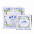
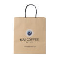
Brand Identity: If you are a franchise or a global brand, your logo must match exactly.
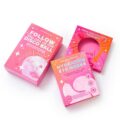
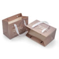
Flooded Colors: If your box is 100% blue, spot ink provides a smooth, rich coverage. CMYK can sometimes result in "banding" or unevenness on large solid areas.
Specialty Effects: You need metallic foil, fluorescent pop, or opaque white ink on dark cardboard.
When to Choose Process Color
Process color is the workhorse of modern packaging. Use CMYK when:
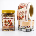
Photography is Central: You are selling food, electronics, or toys where a photo of the product is on the box.
Complex Artwork: Your design involves detailed illustrations, shadows, or textures.
Short Runs & Budget: If you are doing a smaller run, CMYK is generally more cost-effective as it requires fewer setups than a 6 or 7-color spot job.
Practical Checklist for Packaging Projects
Use this checklist when preparing packaging artwork or briefing our team:
Brand Audit: Do my brand guidelines require a specific Pantone (PMS) code?
Image Check: Does my design include photographs or complex gradients? (If yes -> CMYK).
Background Check: Do I have large solid-color backgrounds? (Consider Spot to avoid variation).
Special Finishes: Do I need metallic, fluorescent, or varnish? (Requires Spot/Specialty plate).
Budget vs. Design: Am I using more than 3 spot colors? (It might be cheaper to convert to CMYK).
Substrate: Have I discussed with Dauxin how these inks will look on my specific box material (Kraft vs. Glossy)?
File Prep: Did I include the Pantone references in my artwork file, rather than just Hex/RGB codes?
Frequently Asked Questions (FAQ)
To a degree. This is called a "process bridge." However, about 40% of Pantone colors (especially bright oranges, navys, and greens) look "muddy" or dull when converted to CMYK. If exact matching is critical, stick to Spot.
Not always. If your design is only a green logo on a white box, printing 1 Spot Color is actually cheaper than setting up 4 CMYK plates. However, once you pass 2 or 3 spot colors, CMYK usually becomes the cheaper option.
Absolutely. This is the "Hybrid" approach mentioned above, and it is a standard practice for high-end packaging at Dauxin.
Conclusion: Which Should You Use?
There is no one-size-fits-all answer.
Use Spot for logos, text, and brand precision.
Use Process (CMYK) for photos and complex art.
If you’re not sure which to pick, start with a chat with our design team. At Dauxin, we can analyze your artwork and recommend the best printing method to ensure your packaging looks as good in real life as it does on your screen.
Need a Custom Packaging?
Get a Free Quote Today!